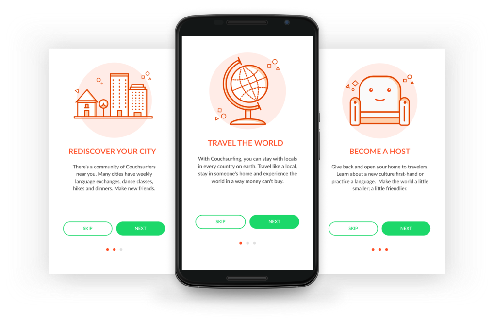
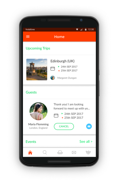
Couchsurfing

Couchsurfing is a service that connects members to a global community of travelers. Even though its international success, the product’s design was not much appealing, sometimes very confusing. Take a look at my approach to CouchSurfing’s mobile app.

Introduction

As a Couchsurfing user, I have noticed some hassles while using the mobile app and always asked myself how it could be better. Its design seemed complex and sometimes not so easy to understand the hierarchy. with multiple options leading to the same place or action, Therefore, the visual aesthetics could be improved, appealing to either new users or existing ones.So the goal of this project was to implement a more organised hierarchal structure with a new appealing visual design making the experience simpler and funnier.

Problems

- Complex hierarchy
- Duplicated features
- Poor visual style

Personas

Jorge, 23 years old, single, is a digital nomad
who works remotely all over the world. Loves travelling and meeting new people all the time. Always seek for friendly hosts whose can show him a few their places.

Bruna, 21 years old, single, is a Design student and currently looking for a position in her field. Is passionate for travelling and likes to explore new places, even if it's in her own city.

Wireframe

The user flow was designed to be easy to navigate and get to other screens as simple as possible, allowing them to complete their objectives efficiently.During the wireframing process some possibilities started to pop up and with further exploration, some decisions were made in order to achieve a better structure. I started off wireframing on paper because it gave me more freedom to explore.

Visual style

To build the visual style, the Couchsurfing brand’s core values were in focus. The earthy orange of the Wordmark was adjusted to provide the human touch and sense of authenticity that is stated in their brand plus other nature-related colours  - blue, yellow and green - were thoughtfully added all together to make the experience more human and vivid.

App’s interface

You will find bellow the final results for the new Couchsurfing app.

Onboarding

Very friendly illustrated onboarding screens to help to introduce the user to Couchsurfing’s atmosphere

Home

On the home screen you can see an overall of all sections, you can check your upcoming trips, people you’re hosting and events near you. A bottom navbar was added to make it faster to navigate through one screen to another.

Search

Search through Travellers, Hosts and Events in a smarter and simpler way. You can also find a place for your next trip, offer host to someone or even a cool event to go.

Trips

Keep control of your trips and create as many trips as you need with ease

Guests

Let people know if you’re up to hosting someone. Accept or not new guests and manage the existing ones.

Trips

Keep control of your trips and create as many trips as you need with ease

Hangouts

While exploring a new city you can use hangouts to meet locals or other travelers, set  a local, time and meet up!

Trips

Keep control of your trips and create as many trips as you need with ease

Menu

A new menu, less complex with only the things you need there.  Access your profiile, see your friends lists, settings and ask for help if needed .

Profile

See more about the person, check their homes are comfy for you and get to know more about their experience in Couchsurfing.

Other screens

Thank you!

Emano Design - Copyrights 2018-2021